The luxury product page: answer what a salesperson would
A beautiful product page that says almost nothing loses the sale quietly. How I design product pages for high-end brands so they answer the questions a good salesperson would.
In a good boutique, nobody hands you a spec sheet. A salesperson watches what you pick up, tells you where it was made, lets you feel the weight of it, and answers the question you were about to ask before you ask it. Online, the product page has to do that job alone, usually on a phone, usually in under a minute.
Over 13 years of building sites for fashion and luxury brands, including Kenneth Cole and Steve Madden, I've noticed that most product pages fail in the same quiet way. They look beautiful and say almost nothing. The photography is lovely, the description is two lines of mood, and the customer leaves with three questions unanswered and the tab still open.
Start with the questions, not the template
Before any design work, I ask the client's best salesperson or stylist to write down the questions customers ask in the store or over the phone. The list is almost always similar. How does it fit? What is it made of? How heavy is it? Can I return it? Can I see it in person?
That list becomes the brief for the page. If a question comes up every week on the shop floor, the answer belongs on the product page, not in a customer service inbox.
Photography that answers, not just impresses
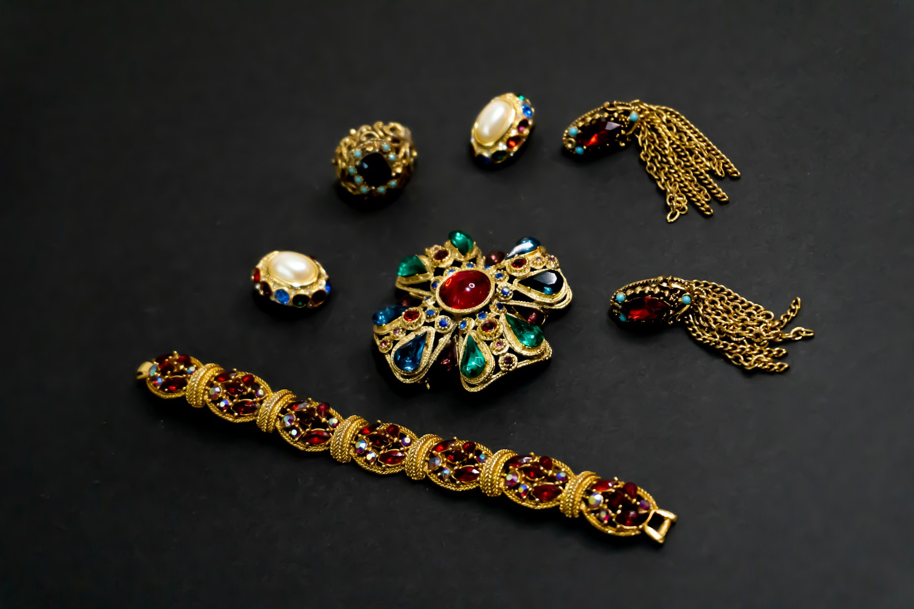
The first image sells the mood. The images after it should sell the decision. For a handbag, that means the interior, the hardware up close, the strap drop, and the bag on a person so the scale is obvious. For jewelry, it means the piece worn, the clasp, the back of the setting, and at least one image in daylight rather than only under studio light.
A useful test: could a customer describe the size of this object to a friend using only your photos? If not, add an image with a familiar reference, or a plain line such as "about the width of a credit card." Honest scale prevents disappointment, and avoiding disappointment is part of what people pay for.
Write like someone who knows the piece
Luxury copy often hides behind adjectives. "Timeless," "elevated" and "effortless" tell the customer nothing they couldn't have guessed. Specifics do the selling: the region or workshop, the hours of handwork, the weight of the gold, the way the leather will darken over the first year.
I usually structure a description in three layers:
- One or two sentences of story. Why this piece exists and what makes it different from the one next to it.
- The facts, scannable. Materials, dimensions, weight, origin, care. Short lines, no prose.
- A fit or wear note in a human voice. "Runs small through the shoulders; most clients size up." The line a salesperson would say.
Keep the tone consistent with the rest of the brand. If the homepage is restrained and the product copy reads like a marketplace listing, the customer feels the seam. I wrote more about that in what makes a website feel expensive.
Put the reassurance where the hesitation is
Shipping, returns, care and warranty usually live in the footer. For a purchase of several hundred or several thousand dollars, they are often the reason someone hesitates. Place a short, plain line close to the price: how shipping works, the return window, whether the piece arrives gift-ready. Link to the full policy, but don't make people go looking for the basics.
Show availability honestly too. "Made to order, ships in three weeks" is a perfectly luxurious sentence. Discovering it at checkout is not.
Offer a person, and keep it optional
High-end customers often want a conversation before they commit, but they don't want to be chased. A quiet link under the add-to-bag button works well: book a private appointment, ask a stylist a question, or check whether the piece is at a nearby store. I covered how to design that step in the private appointment.
If you add AI chat here, it has to know the product as well as your best salesperson does, and it should hand over to a human the moment a question becomes personal. Anything less cheapens the brand.
Write for the reader you can't see
A growing share of shoppers now meet your product through Google's AI answers or an assistant like ChatGPT before they ever reach your page. Those systems read the page first. Clear product structured data (name, price, availability, materials) and specific, factual text help them describe the piece correctly. Two lines of mood give them nothing to work with. My AI visibility check shows how your brand currently reads to them.
A short checklist
- Every recurring in-store question is answered on the page.
- At least one photo shows true scale, and one shows the detail a buyer would inspect by hand.
- The description has story, facts and a human fit note.
- Shipping, returns and lead time sit near the price.
- There is a calm way to reach a person.
- Structured data matches what the page says.
None of this makes a product page louder. It makes it more confident, which is exactly how a good salesperson feels on the shop floor. If you'd like a second pair of eyes on your site, start with my luxury homepage audit.
Building or refreshing a high-end brand? I help fashion, luxury, hospitality and professional brands with brand, website and AI work, from New York and Tallinn.
Start a project

