What makes a website feel expensive
Luxury online isn't about gold accents or slow animations. It's restraint, pacing and a hundred small decisions a high-end customer feels before they can name them.
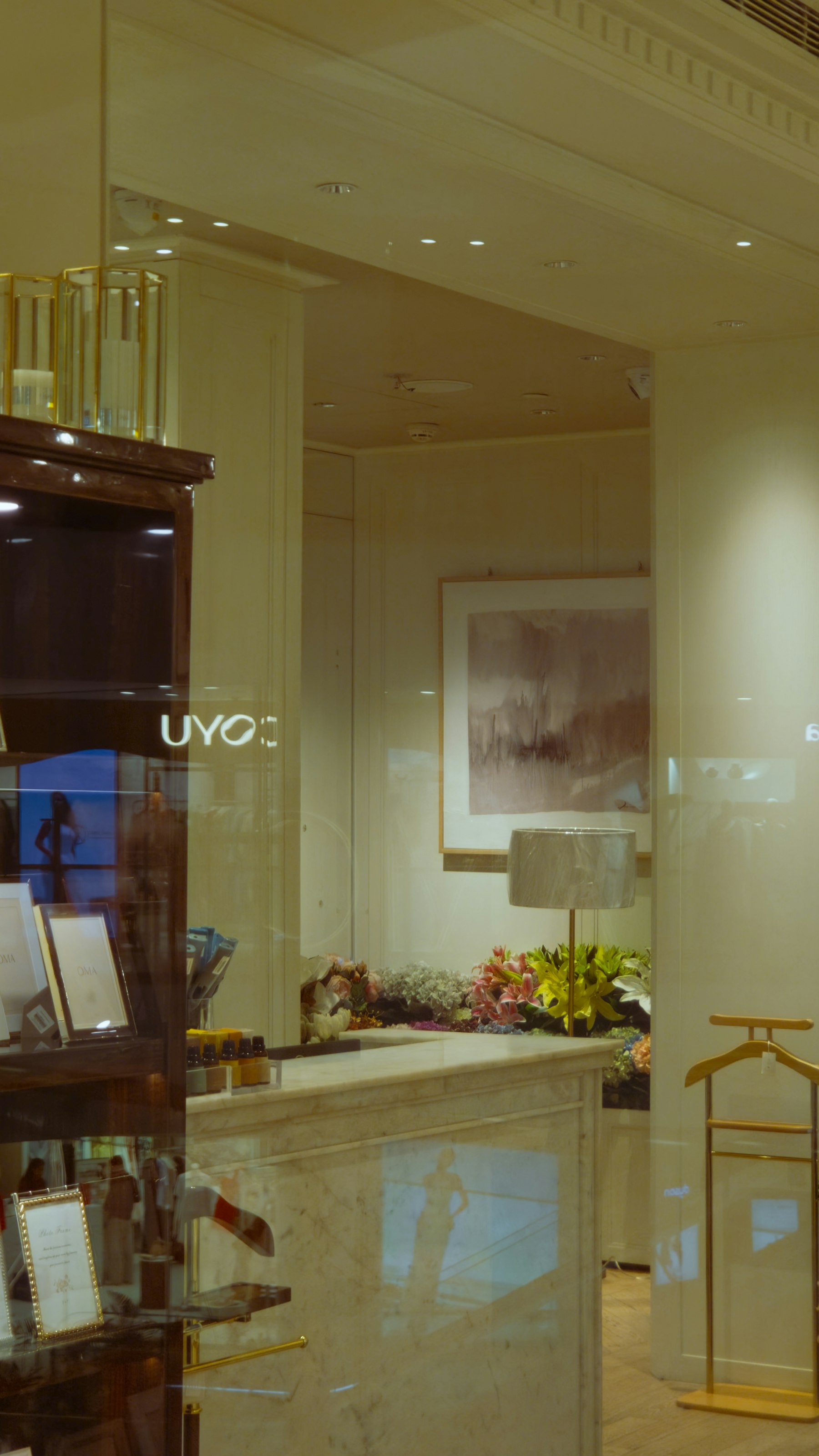
A customer who spends $2,000 on a coat or $900 a night on a hotel room decides within seconds whether your website matches the price. They rarely say why. They just leave, or they stay.
After years of building sites for fashion and luxury brands in New York, I've found that "expensive" online comes down to a handful of decisions that are easy to get wrong.
Restraint beats decoration
The instinct is to add: a gold line, a slow parallax, a script font, a pop-up offering 10% off. Each one makes the site feel cheaper. The most premium sites remove until only the product, the photography and a few confident words are left. White space is not empty. It's the digital version of a quiet store with three pieces on the table.
Pacing matters more than motion
Luxury is unhurried, but it is never slow. Pages should load instantly, and the story should unfold at a measured rhythm: one strong image, one line of copy, then the next. Heavy animation that makes a visitor wait reads as insecurity, not elegance.
Typography carries the brand voice
Most sites pick a fashionable serif and stop there. What separates a premium site is the system: consistent sizes, generous line spacing, careful capitalization and no orphaned words hanging at the end of a headline. Customers notice a sloppy line break the way they notice a loose thread.
Every detail is a promise
A typo on the About page, a broken Instagram link, last season's collection still in the menu or a footer that says © 2022: each one tells a customer that nobody is minding the store. If the website is careless, why would the stitching be any different?
Discounts are a brand decision
A permanent "Sign up for 15% off" banner trains your best customers to wait for a code. If you need a list, offer access instead: early previews, private appointments, the story behind a collection.
The checkout is part of the experience
Many luxury brands design a beautiful homepage and then hand the customer to a default template at the most important moment. Shipping, returns, packaging and aftercare should be written in the same voice, and with the same care, as the campaign.
None of this requires a bigger budget. It requires someone who looks at the site the way your best customer does, and is willing to take things away.
Selling to American buyers? I help Estonian, Nordic and Baltic companies adapt their websites, messaging and launch materials for the US market.
Request a free US-readiness scorecard

