The private appointment: designing booking flows for luxury clients
For jewelers, salons, tailors and private client firms, the booking flow is where a browser becomes a client. Here is how to make it feel like the first minute of the visit, not a software form.
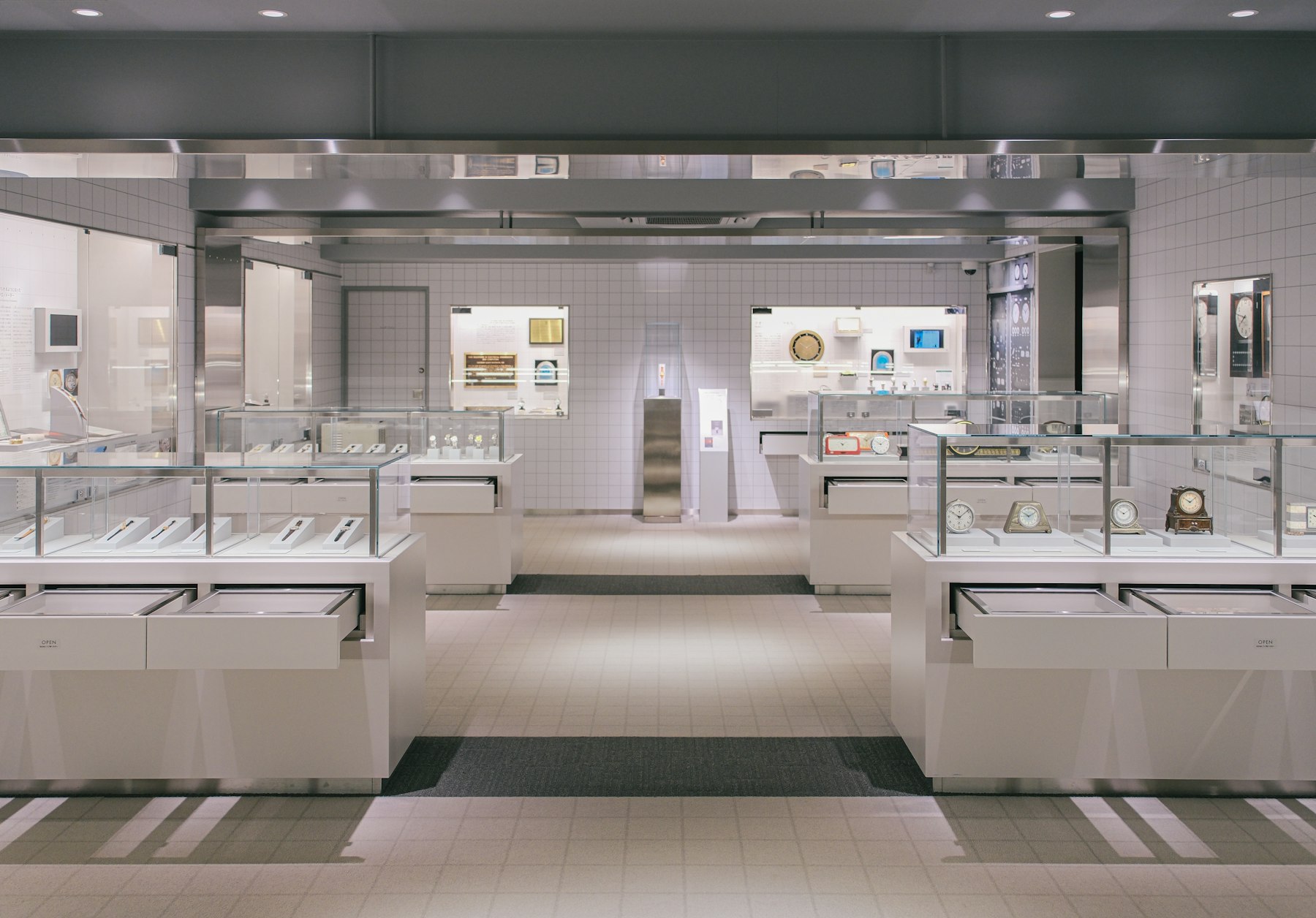
For a fine jeweler, a bridal salon, a private bank or a tailor, the most valuable thing on the website is rarely the product page. It’s the button that says “Book an appointment.” That’s where a browser becomes a client with a name, a date and a reason to walk in.
And yet it’s usually the least designed part of the site. The homepage gets months of attention. The booking flow gets a third-party widget dropped into a page at the end of the project, in a different font, asking questions no salesperson would ever ask in person.
With the holiday season close, this is the moment those flows get their heaviest use. Here’s how I think about them.
The appointment is the product
When someone books a private viewing, they aren’t filling out a form. They’re accepting an invitation. Everything about the flow should feel like the first minute of that visit: unhurried, attentive and clearly run by people who know what they’re doing.
That changes the design brief. The question isn’t “how do we collect the data we need?” It’s “how would our best client advisor greet this person, and how do we put that on a screen?”
Ask less, and ask it later
The most common problem I see is a form that front-loads everything: name, email, phone, budget, occasion, how did you hear about us, all before the client has even seen an available time. In a boutique, no one asks for a budget at the door.
- Lead with the choice, not the paperwork. Let people pick the type of visit and a time first. Contact details come once they’ve committed.
- Keep required fields to what you truly need. Usually a name, an email or phone number and a time. Everything else can be optional.
- Replace the budget field with a softer question. “Is there anything you’d like us to prepare?” gets you more useful information, and it reads like hospitality instead of qualification.
Name the visit types like a concierge would
“Appointment” is vague. Clients want to know what they’re signing up for. A short menu of clearly described visits does a lot of quiet work:
- A private viewing in the salon, with how long it usually takes
- A virtual consultation, for clients who are out of town
- A design or bespoke consultation, if you offer custom work
- Service visits such as repairs, fittings or resizing
Each one should say who the client will meet, roughly how long it lasts and whether anything is expected of them, like bringing a piece in. Clarity here is a form of respect. It also lets your team arrive prepared.
Make the widget look like your brand
Most booking tools are perfectly capable. The problem is that they look like booking tools. A calendar in system blue, a generic confirmation screen and an email signed by a software company undo a lot of brand work in about forty seconds.
In Webflow and Shopify builds, I usually either style the embedded tool carefully or build the front end of the flow natively and pass the result to the scheduling system behind it. Either way, the checklist is the same:
- Your typefaces, colors and spacing, all the way through
- Your voice in every label, button and error message
- A confirmation page that thanks the client and tells them exactly what happens next
- A confirmation email that comes from your address, written in your tone, with the location, parking or entrance notes and a direct contact
Leave a human door open
Some clients will never book online. They want to call, send a text or write a short note and have someone get back to them. Others will start the flow and stop because their request doesn’t fit a category.
A good flow makes the alternative obvious: a phone number, a simple “Prefer to talk first?” link, and a promise about response time that the team can actually keep. If you offer AI chat, it can help answer practical questions and offer times, but it should hand over to a real person the moment a client asks for one.
Measure the visit, not the form
Booking flows are easy to measure badly. A completed form is not the goal. A kept appointment is. When I review these flows with clients, we look at a few things together:
- How many people start the flow and how many finish it
- Where they drop off, field by field
- How many booked appointments are actually kept
- What the advisors hear in the room about how the booking felt
That last one matters most. The people who meet your clients will tell you very quickly if the website is sending them prepared, comfortable guests or confused ones.
Where to start: if you only do one thing this season, book an appointment on your own website from your phone, start to finish, and read the confirmation email as if you were a new client. Note every moment that feels like software instead of service. That list is your brief.
In thirteen years of working with fashion and luxury brands, including names like Kenneth Cole and Steve Madden, the pattern I keep seeing is simple: the brands that feel most expensive online are the ones that treat every step as part of the experience. The booking flow is where that belief gets tested.
Selling to American buyers? I help Estonian, Nordic and Baltic companies adapt their websites, messaging and launch materials for the US market.
Run the free US-Readiness Check

