Expensive brands, cheap mistakes: what luxury homepages get wrong
I checked the US homepages of some of the world's best-funded luxury brands. Behind the campaign imagery: template leftovers, broken privacy links and typos in consent forms.
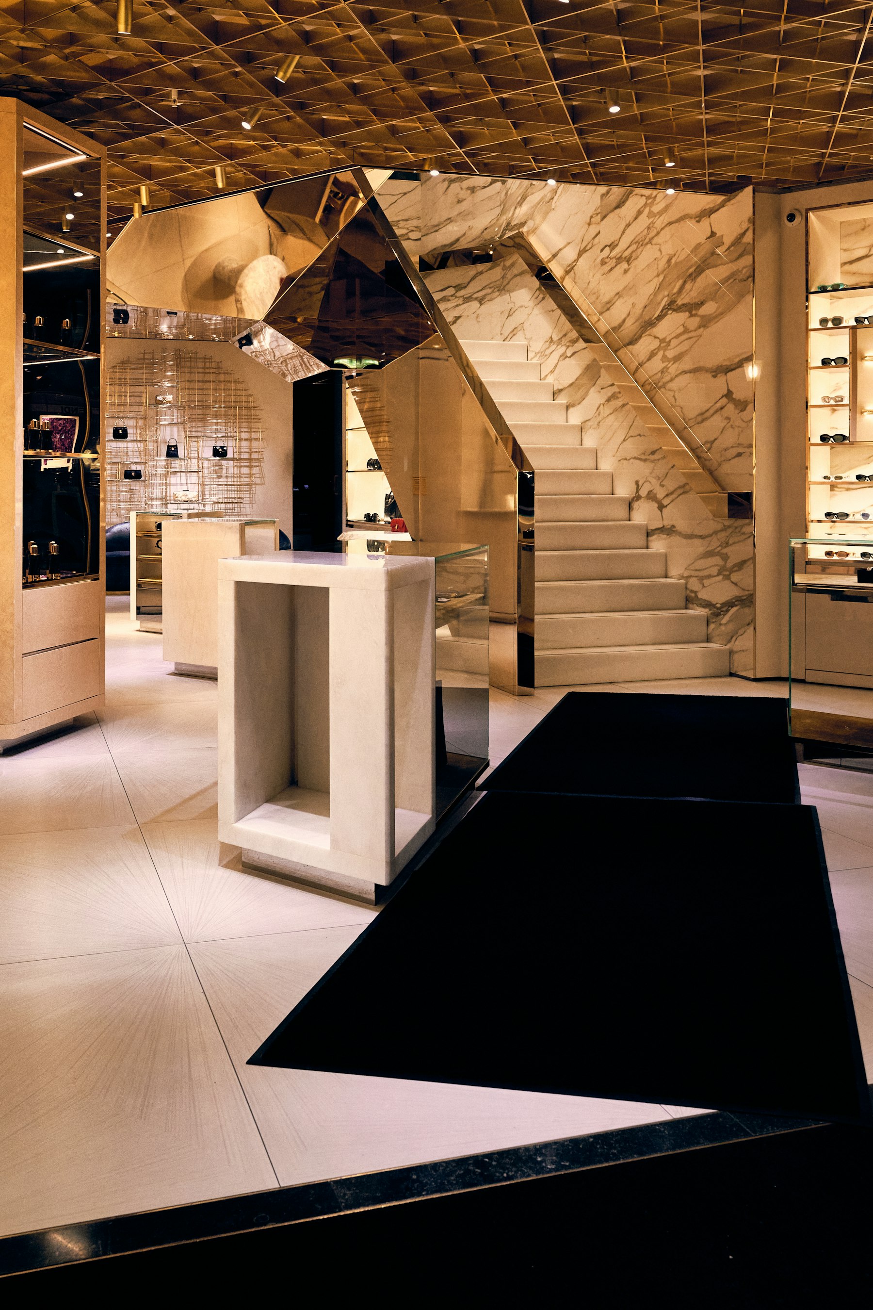
A $3,000 handbag deserves a homepage that's been looked after as carefully as the stitching. So I spent a day reading the US homepages of luxury and premium brands the way two important visitors do: a careful customer, and a machine. Search engines, screen readers and, increasingly, AI shopping assistants read the code behind the campaign images, not just the images.
These are some of the best-funded e-commerce operations in the world. Here is what I found, checked in a browser on October 24, 2026. Sites change daily, so some of this may be fixed by the time you read it, which would be good news.
A template's name where the brand name should be
On Tiffany & Co.'s US homepage, the logo link is titled "Commerce Cloud Storefront Reference Architecture Home", and the page's keywords tag says "Commerce Cloud Storefront Reference Architecture." That's the name of the Salesforce starter template the site was built from. It's invisible to most shoppers, but it's what a screen reader or a crawler reads when it meets the most famous blue box in the world.
Privacy links that don't work
US privacy law expects a working way for shoppers to opt out of having their data sold or shared. Two examples:
- On Dior's US site, the "Do Not Sell or Share My Personal Information" link doesn't lead to a page. Its address is a JavaScript error message: "React has blocked a javascript: URL as a security precaution."
- Louis Vuitton's privacy notice tells shoppers how "to opt of non-automated sharing," with the word "out" missing.
Consent copy nobody proofread
- Michael Kors' sign-up consent text reads: "We will use your information accordance with..."
- La Mer's checkbox reads: "I agree to the Notice of Notice of Financial Incentive."
These are the sentences a brand asks customers to legally agree to. They're also the sentences nobody on the creative side ever reads.
Leftovers in the code
- Tory Burch's homepage code carries offers that read "USE CODE xxxx", 15 times. Shoppers don't see them, but they're a sign that unfinished content ships to production.
- Chanel describes three images to screen readers as "undefined."
- Burberry's US homepage contains 36 main headings (H1s). A page should have one; it's how search engines know what the page is about.
Small slips, big names
- Hermès spells itself two ways in its own page title: "The official Hermes online store | Hermès USA."
- Michael Kors' Google description is double-encoded, so "&" can show up as "&".
- Louis Vuitton's "Paris Design Week" link opens the Milan Design Week article.
- British spellings on US pages: "favourite" (Prada), "Jewellery" (Chanel).
Credit where it's due
Most of these sites get the big things right: current seasonal content, clear navigation and beautiful photography. None of the issues above is a crisis on its own.
Why it still matters
Luxury is a promise that someone is paying attention. Customers can't see code, but the machines that increasingly stand between a brand and its customers read nothing else. A broken privacy link is a legal exposure. A template name in a logo link says the opposite of "handmade." And every one of these fixes takes a developer an afternoon, not a redesign.
The pattern is always the same: the campaign gets a creative director, and the code behind it gets nobody. Someone should look at the site the way a careful customer, and a machine, does.
Method
US homepages, checked in a desktop browser on October 24, 2026, by reading the rendered page and its code. Gucci, Balenciaga, Saint Laurent and Bottega Veneta block automated access and weren't included. Some brands redirect visitors outside the US, and I only report what I could confirm on the US site. I have no commercial relationship with any of these brands. If you work for one of them and something has changed, tell me and I'll update this page.
Selling to American buyers? I help Estonian, Nordic and Baltic companies adapt their websites, messaging and launch materials for the US market.
Request a free US-readiness scorecard

